AERO
The new user interface in Vista is called AERO. This doesn't mean it's light, fluffy and full of holes - it actually stands for Authentic, Energetic, Reflective, and Open, in case you wondered. Visually, it's an evolution of the Windows XP desktop shell and it's clear from the meaning of the acronymn that AERO is much more a design philosophy than an actual one-off desktop theme.Instantly this will begin to appeal to those of you who long for a more... Apple flavoured desktop environment. It's heavy on the graphical effects, and rightly so. For the first time, Windows will take advantage of your 3D accelerator to offer reflective and transparent effects in windows with a negligible load on the OS. How so?
In Windows XP currently, applications each redraw the screen individually. If a part of the screen needs updating, whichever application is doing the updating simply draws over the top of it and sends the newly drawn image over to the graphics card for output. Windows has no memory of what was previously on screen before it was redrawn.
AERO uses the 3D hardware to layer redraws on top of each other, off-screen (similar to how off-screen render targets are used in 3D). The use of the 3D hardware makes it possible to achieve composition effects that were horrendously slow previously. For example, transparency can be achieved by blending redraw layers in hardware, so that the windows behind it show through. Windows can fade in an out by changing the transparency level. Windows can be manipulated as 3D objects and tiled, moved or rendered in different ways from those we have now. The composition is done in hardware because graphics hardware spends all its time in games compositing scenes in this manner, and so is very fast and efficient at doing so. (Apple OSX has been doing this since its release of Jaguar, over 2 years ago. Spot a trend? -Ed)
Consequently, a DirectX 9 graphics card will be required to run AERO at maximum speed and quality. Could we see Windows Desktop benchmarks in our graphics card reviews pretty soon?
As this is all part of the new programming interface, many applications written to take advantage of the Windows XP theming process can have AERO effects applied with great effect, with little work on the part of the programmers. The ease of use for programmers is helped by the fact that Windows Presentation Foundation is basically a markup language, which enables the GUI to be defined by simple statements.
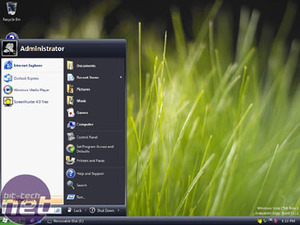
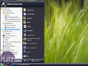
Looking at the GUI itself, the start menu has clearly changed very little, being Microsoft's well researched 'GUI for the masses' project. However instead of filling your screen with sub-drawer after sub-drawer of programs, it now refreshes the list in the existing left hand pane as you can see from the second image. You can also use the search feature to 'smart find' applications as you begin typing the name, a little like Apple's Spotlight.

MSI MPG Velox 100R Chassis Review
October 14 2021 | 15:04


Want to comment? Please log in.