What's coming in Windows 8?
It's been 16 years since the jump from Windows 3.1 to Windows 95. In that time we've seen mobile phones dominate train journeys, three atrocious Star Wars films and Sony ousting Sega from the console business, but we're still basically muddling around with the same desktop computer interface.We might have NTFS and transparent windows, but we still have the Start menu, the taskbar, the clock in the corner and the Recycle Bin. The basic Windows interface hasn't really altered in 16 years, but that looks set to change with the introduction of Windows 8, which Microsoft has just publicly demonstrated at the D9 conference.
Julie Larson-Green, Microsoft's corporate vice president for Windows Experience describes the operating system's development as a 'reimagining of Windows, from the chip to the interface.' After owning the desktop computer for the best part of two decades, Microsoft realises that the computer industry is changing, and this means the OS needs to adjust in tandem.

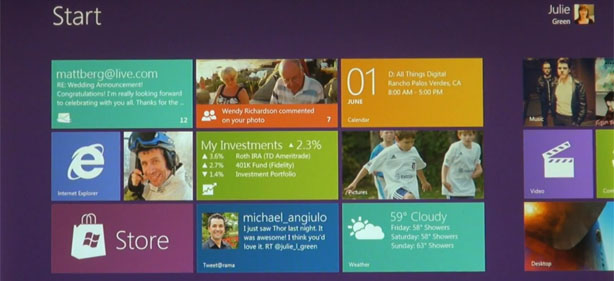
All Windows 8 users will be greeted by the new tile-based Start screen
One of the main factors here is the popularity of tablet devices. With the hysteria surrounding the iPad, it's easy to forget that Microsoft started pushing the tablet concept itself back in 2002. But that was ultimately a flawed tablet concept – the virtual ink system worked well enough, but it was basically a flat Windows PC for people who wanted to annotate notes – it wasn't a user-friendly gizmo that let you go anywhere you wanted with the flick of a finger.
This appears to be the main influence behind the new interface in Windows 8, which you can see in the demo video below. 'The first thing you're going to see when you start Windows 8 on your PC is the Start screen,' says Jensen Harris, Microsoft's director of program management for the Windows user experience. 'The Start screen is this personal mosaic of tiles - every app on your system is represented by a tile.'
According to Microsoft, this part of the interface is based on HTML5 and JavaScript, and is happy to be controlled by touch or a keyboard and mouse combo. The idea behind the tiles is that they can show you a lot more information than an icon – Harris gives the example of a weather app that shows you the current temperature without you having to open the app.
Microsoft's Jensen Harris guides you through the latest build of Windows 8
Microsoft has also tweaked the Snap feature. This isn't just a handy way of putting one maximised app next to another one anymore. Instead, you can now slide a new app into the screen with your finger, a little bit like the pulldown menu at the top of an Android phone, and drop it in where you want it.
The 'classic' Windows interface
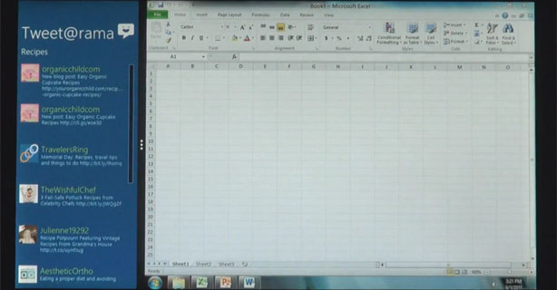
This isn't anything particularly innovative, of course. We've seen most of this already in Microsoft's Windows Phone 7 operating system, as well as other touch-based interfaces. The difference is that Microsoft clearly sees this as the primary gateway into its next operating system.This doesn't look like a Media Center Edition-style shell that sits on top of a familiar version of Windows, either – it looks like a primary part of the OS. There's an interesting part in the demo video about three minutes in, where Harris shows the new OS running basic apps such as Excel. At this point, you see what looks like the familiar Windows Taskbar and Start button come into view, but then Harris slides in another app from the side using the tile interface.
Of course, the only information we have is the small amount that Microsoft has chosen to share, but it looks as though the 'classic' Windows interface is a virtualised part of the new OS, rather than the foundation of the interface itself.

The classic interface is still there, but you can still slide in the new
interface from the side
How this works exactly remains to be seen, and we may be wrong. Either way, it looks as though the classic Windows interface will still be an option, but Microsoft is clearly trying to push the new interface as the standard way of interacting with Windows. The idea, according to Harris, is that this version of Windows will run happily on PCs, laptops and tablets. Windows 7 already does that, you might think, but there's also no getting round the fact that a Windows 7 tablet has a really clunky interface when compared with a 'proper' tablet OS, such as Apple's iOS.

MSI MPG Velox 100R Chassis Review
October 14 2021 | 15:04


Want to comment? Please log in.