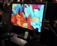
VG236H Image Quality
At its factory settings, the brightness and glossy coating of the VG236H gives it a fairly vibrant look. However, after a few minutes the coldness of the default setup becomes apparent – whites are tinged with blue, as are greys. We therefore headed into the OSD to see if we could tweak the setup for a more balanced look.The buttons for the OSD are lined up on the right of the lower edge of the bezel, arranged in a line. This arrangement isn’t the friendliest we’ve ever used, with the annotations not particularly clear and the unintuitive way that the up and down buttons actually move the selection left and right in some sections of the menu.
The OSD menu has a few setup modes, from Scenery to Game to Night View, but none of these did much to the picture. Or at least nothing productive or welcome. The Image screen has a few useful options such as Contrast and Saturation, while the Color screen lets you set the colour temperature and also a quite frankly weird option called Skin Tone.
As well as being slightly cool, the default setup was terrible at discerning bright tints of colours in the Lagom tests. We therefore lowered the contrast to 59 but kept the brightness at 100 – this gave us the best colour range, but also made the screen appear fairly dull. We also set the colour temperature to Warm to combat the blue tint of the screen. This is the standard way we set up screens – trying to get as neutral a white tone as possible and as wide a contrast range and colour spectrum.
While this standard procedure usually makes screens look better, the Asus looked noticeably worse – it lacked the vibrancy of the default setup and we saw a terribly high contrast range, where even fairly light greys were shown as black.
This lack of detail in dark shades meant that the shadows of our test videos were just solid black – there was little detail to be seen, with dark clothing just blending into dark backgrounds and so on. At least the black level was nice and low, so the image looked solid and realisitic – a high, grey black level can really kill your enjoyment of everything you see on your PC.
While the colours of the screen were fine, they weren’t up to the arresting vibrancy of a PVA or IPS panel, and as we hunted around trying to spy the detail and find flaws in the various scenes we noticed that the Asus has a reasonably narrow vertical viewing angle, as do most TN panels. The viewing angle is fine for normal use as long as you don’t duck or crane your head.
The halls of Arkham Asylum looked dark and brooding, but the shadows lacked life – the bat-cape lacked detail and the halls were dark rather than dim. The oversaturation effect of the solid and deep black level helped Dirt 2 look impressive however. We saw little sign of input lag or inverse ghosting, so the quoted 2ms response time is spot on.
Even when switching back to the default, brighter setting, we didn’t see much improvement in 3D gaming from the Asus compared to the previous 3D screens we’ve tested. We’d expected the extra brightness and the glossy coating to be able to shine through the tinted 3D Vision glasses, but were greeted by the usual feeling of wearing sunglasses indoors.
Conclusion
The Asus VG236H is probably the best of the 3D screens we’ve tested, but as the previous screens were dull, cheap TN panels that’s not actually saying much. The Asus does have a brighter than usual backlight that should have punched through the 3D Vision (sun)glasses with more effect, but we didn’t experience much benefit from this or the vibrancy that the glossy screen coating gives. Worse still, we're yet to be impressed by the actual 3D effect either.In non-3D situations, the Asus has mediocre image quality. Any tuning it might have received to combat the dulling effect of the 3D Vision glasses means that when you’re not using them, you’re offered with a choice between brightness but no fidelity with bright colours or muted colours with no definition of darker shades. Neither is an option we want from a brand new screen. As we’re also sceptical about the benefits of Nvidia 3D, this isn’t a screen we can recommend.
- Image Quality
- x
- x
- x
- x
- x
- x
- -
- -
- -
- -
- 6/10
- Features
- x
- x
- x
- x
- x
- x
- x
- x
- x
- -
- 9/10
- Value
- x
- x
- x
- x
- x
- -
- -
- -
- -
- -
- 5/10
- Overall
- x
- x
- x
- x
- x
- x
- -
- -
- -
- -
- 6/10

MSI MPG Velox 100R Chassis Review
October 14 2021 | 15:04


Want to comment? Please log in.