
Manufacturer: Revoltec
Price (as reviewed): €69.90 (Germany)
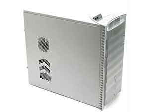
Obviously the main thing anyone wants out of a PC case is a good sense of style, especially since many PCs are now starting to find their way into the living room under the guise of being a media centre. It's unfortunate then that the Revoltec Zirconium is one of the ugliest computer cases we've ever seen.
It was so ugly in fact that, when I opened the box using a little tip from the forums, and set it on the empty desk next to my own other members of staff actually recoiled, asking in not so pleasant terms why the hell I felt it necessary to mould my own vomit into a silver PC case.
It was promptly agreed that when I wasn't working on the case review then the Zirconium should be hidden underneath the desk, preferably covered in loose pieces of cardboard so as not to offend any visitors or small children who happened to be passing.
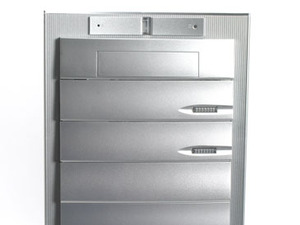
The front of the case is the main culprit and whoever thought that layering the drive bays into a ridged formation should be hunted down and pelted with other badly designed hardware until said pelters get tired and decide to do something else. Seriously, the front of the case looks like the spine of a deformed Stegosaurus when examined side-on.
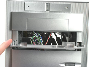
The designer has obviously half-heartedly attempted a futuristic look, with the front panel fanning out to be a little wider than the case strictly needs to be and the drive bays stealthed with spring-loaded covers. We've never really been a fan of stealth drive covers as they often end up being more of a hassle than they're worth, but it's good at least that the buttons on the Zirconium are large and the springs bouncy enough to snap the cover shut sharply.
The front of the case also has a plastic column in the lower half, which lights up blue when the case is turned on as a LED shines down through it. LEDs like this generally evoke a 'Marmite reaction' in users, meaning that you'll either love it or hate it. For our part we don't really mind it being there, so long as we can rip it out easily if we want to do a spot of on-the-fly case modding. Unfortunately, this wasn't an option as the rod seemed secured in there quite firmly, so mod makers must either work round it or cope with it.
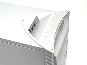
On the top of the case things get even worse for potential modders, with the Revoltec brand cut deeply and widely across the top of the front end.
Whether non-modders will mind the branding or not is obviously a matter of personal taste, but we personally aren't massive fans of it, especially when it already has the logo on the front of the case once in a smaller script.
The top of the case also house a selection of the usual ports, specifically two USBs, a microphone and headphone port and an IEEE 1394 port. It's getting pretty standard now to have connections like these on the front so it doesn't earn it any real brownie points for their inclusion, but the gentle slope on which they are mounted feels quite nice to use and doubles as a grip for when the case is moved about.
The one bad thing we would say about the connection set on the top of the case is that its position and shape makes it very likely to clog with dust over time and, as any reasonably experienced and anally retentive geek will tell you, it can be a real pain to clean dust out of a USB port every week or two.
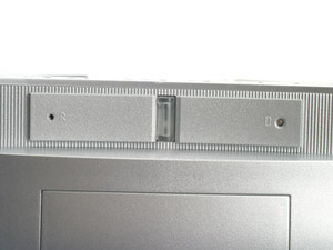
The power button, as regular readers will know, is the real test of a case from our point of view. It's a small detail, so small that it's often missed, but a rattling power button that doesn't fit snugly into place is usually a sign of poor build quality. Ideally we want the power button to have a decent amount of resistance and to feel satisfying to use, just like the Cooler Master 830, which had the added bonus of making the power button look like the face of Optimus Prime.
The Revoltec Zirconium didn't let us down in this department, with the power button proving rattle-free and giving a nice loud click when pushed, proving in our eyes that this was a chassis with decent build quality even if it did look horrible.
The reset button balances everything out though because it is off to the left of the power button and is recessed into the shell so that a pin is needed to push it. Design wise, it's a fatal flaw that completely crumbles any hope the buttons had of salvaging the systems exterior in our eyes.
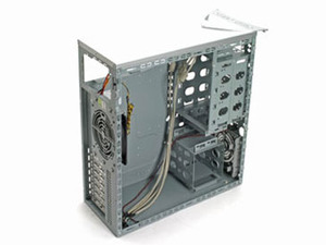
Still, a PC chassis isn't just measured by how good it looks and how good the buttons feel, so without further ado we open up the Zirconium and have a peek at what's inside the belly of this beast.

MSI MPG Velox 100R Chassis Review
October 14 2021 | 15:04



Want to comment? Please log in.