Gettysburg: Armoured Warfare Review
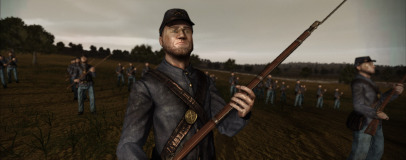
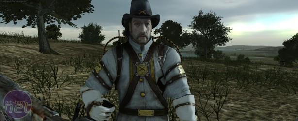
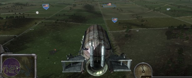
While there's no introduction to tell you as much, the overall idea of Gettysburg is that huge civil-war style battles are fought over massive battlefields, with control points scattered around and generally a steady feed of participants injected into the fray. Players on either side of the war float around incorporeally, entering into battle by possessing the soldiers, tanks and zeppelins below them. Rudimentary AI fills the empty spaces.The range of units available is adequate, if not brimming with personality - gatling guns that can be wheeled around, cavalry with rifle animations that seem never to work properly and tanks, snipers and infantry aplenty. These are the tools through which you can win your war or, more likely, tolerate it confusedly.
Actual combat in Gettysburg is a dreary affair, with issues arising as much from a lack of feedback and a poor UI as much as from the bizarre choice of eras. Little attempt seems to have been made to balance the authentic civil war units against their futuristic counterparts, or to balance classes against each other. Tanks, for example, are the kings of the battlefield and can kill most anything within visual range in just a few shots.
The scale of the levels combined with the rarity of other players (the most we ever saw online at once was 12 people on a 64 player server) means that even at its best, Gettysburg fails to offer much in the way of tension. Endless hikes across uninspiring terrain is the dish of the day, with no apparent sprint button available to help the minutes pass quicker.
On top of this, the moment to moment action feels just as broken as the larger picture due to a bewildering lack of information in some areas, and overabundance in others. There is, for example, no ammo counter or life meter which represents how damaged your current unit is, but at the same time there's developer information such as frames per second and amount of RAM used that's enabled by default.
Why exactly the internals of the game spend so much time obsessing over performance isn't exactly clear either, as Gettysburg is by no means a graphically intensive experience. Units stand around, unblinking and crudely animated, while terrain is indestructible save for the section of fence and wall that mark field boundaries and appear as the only example of cover in the game. These, while immune to artillery blasts, will disappear in many-meter chunks when touched by moving vehicles.
Even the font used by the game is small, too square and hard to read against the grimy, too dark colour palette used.
With no further modes other than an offline, versus AI practice mode - which is itself wounded by the very basic abilities of the AI - Gettysburg's offering is even more limited. It's admittedly got a budget price tag attached to it, so a multiplayer-only focus is entirely forgivable, provided of course that the quality is there. In this case, it's not.
Gettysburg initially seemed to have so much potential and, with a single man behind 99 per cent of the game's work, we were really hoping that that would be realised. As it is, Gettysburg turns out to be a barely populated, often incomprehensible and unfailingly disappointing experience that all gamers should be careful to avoid.
-
Overall10 / 100


MSI MPG Velox 100R Chassis Review
October 14 2021 | 15:04


Want to comment? Please log in.