
We had the chance to go hands-on with the Xbox 360 at the recent Multiplay i26 event, and we spent a substantial amount of time playing the games that were demoed there. Since then, we have another chance to get to grips with the hardware and the games, so whilst these aren't full reviews, hopefully they'll prove useful teasers, especially given our unique 'technical viewpoint' on the hardware - a viewpoint you probably won't see on the gaming sites that will be launching opening-day coverage.
Console hardware
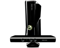
By now, you all know the Xbox specs. A triple-core IBM chip, designed specifically for Microsoft. A unified architecture GPU, designed by ATI specifically for Microsoft. An optional hard drive, a unified memory architecture, Windows Media Center Extender functionality - all of it is designed to enable an awesome gaming experience. Of course, that's not taking into account the industrial design, with a white unit inspired by the concept of an 'inhale', an intake of breath - quite literally, breathtaking.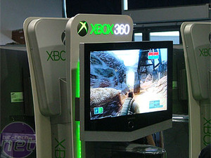
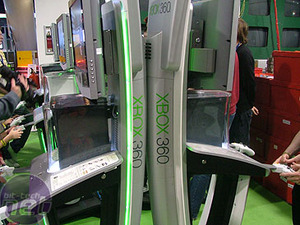
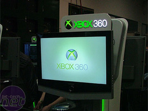
The demo pods that Microsoft are sending out to retailers have Xbox 360 consoles sat right in the middle, and are paired with Samsung screens. The screens are 1280x720 resolution - that's 16:9, 720p specification. Each console has a couple of controllers wired to it. Some of the consoles we saw were black - these are development units that can play unfinished games, and have extra options on boot.
Using the Dashboard is incredibly intuitive. The Dashboard can be brought up from within any game, and it gives you instant access to the rest of your Xbox. You can launch into any of the functionality of the Xbox from anywhere, and this gives you some awesome flexibility when using the console.
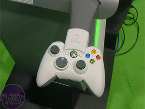
Playing with the controller itself is interesting. It's undoubtedly an improvement over the Controller S that ships with the current Xbox. It's ever so slightly smaller, and a slightly more ergonomic shape. It's clearly a vast improvement over the original Xbox controller, which was apparently designed for those with a more Hagrid-esque complexion. The black and white face buttons have been replaced with a couple of shoulder buttons, which supplement the existing triggers on the pad. This is a layout that works really well, with all the buttons now being easily accessible and no more 'dead functions' being mapped to the black and white buttons. The controller is responsive, and our initial tests with the wireless suggest there's no lag or interference - phew!

MSI MPG Velox 100R Chassis Review
October 14 2021 | 15:04




Want to comment? Please log in.