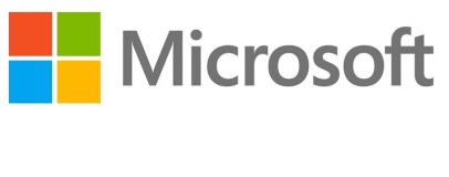
Microsoft has put an end to 25 years of history with a dramatic announcement. No, we're not talking about Windows 8 or its Surface tablets: we're talking about the company's new logo, pictured to the right.
Part of the company's rebranding exercise ahead of the launch of Windows 8 and its much-derided user-interface-formerly-known-as-Metro, the new logo dispenses with the oblique font of the company's previous design in favour of a simpler, sans serif font in an eye-pleasing grey. As before, the kerning is adjusted so that the letters F and T join together - one of the few things, aside from the name Microsoft itself, which ties the new logo to the old.
The logotype is joined by a new icon for the company, a tile-based affair based on straight-forward squares arranged in - surprise-surprise - a format reminiscent of a window. Unlike the previous, somewhat confusing, flag design, the logo is straightforward, clean and symmetrical.
It's also not exactly new: old TV adverts for Windows 95 used a very similar logo as their eye-catch, separate to the familiar Windows flag, with only the colours differing slightly - orange in the TV adverts has become red in the new icon. Whether intentional or not, it's at least a nod to the past.
Speaking of nods to the past, those familiar with Microsoft's history may see a shade of the original Microsoft Windows logo in the new company-wide design. While the first copies of Windows included an old-fashioned serif font, the single-colour icon was based around an asymmetric four-pane panel. Colour may have been introduced, the rounded edges filed off and the asymmetric layout ditched in favour of a more harmonious symmetric design, but the four segments remain.
While it's easy to dismiss Microsoft's new logo as being far from newsworthy, little could be further from the truth: it's the first time the company has changed its overall identity in a quarter of a century, and marks seriously changing times for the software giant. Increased competition from Apple - which has been enjoying a marked halo effect from sales of its tablets and smartphones - has Microsoft branching out into first-party PC sales for the first time, albeit in tablet form with its Surface products.
That's a move which has angered many of the company's OEM partners, who are now finding their own Windows RT and Windows 8 tablets in direct competition with those bearing Microsoft's own name - a scenario that has never before happened at the company, and would be unlikely to have happened under previous head Bill Gates.
It also represents Microsoft's continuing desire to unite its disparate products - including smartphones, tablets, desktops, laptops and games consoles - under the banner of what was once known as Metro UI. Previously, the Windows flag has been limited to Windows products - but the four-colour boxy icon will now form part of the company's entire brand image. In other words: if you had hoped the company might reconsider its user interface direction, think again.
The new logo represents a complete reinvention for one of the world's biggest companies, and carries with it a none-too-subtle hint for Microsoft's partners and competitors: we're not doing changing just yet.

MSI MPG Velox 100R Chassis Review
October 14 2021 | 15:04


Want to comment? Please log in.