Chernobyl likeness nailed in S.T.A.L.K.E.R
January 5, 2007 | 13:25

THQ have sent over some screenshots and information from the latest S.T.A.L.K.E.R diaries. Below you’ll find the developers explanation as to why Chernobyl was chosen as the setting for the game, the background work that went into creating ‘The Zone’, as well as information about how music has been chosen to provide ambience. Without further ado here is the diary in its entirety:
S.T.A.L.K.E.R Developer Diary
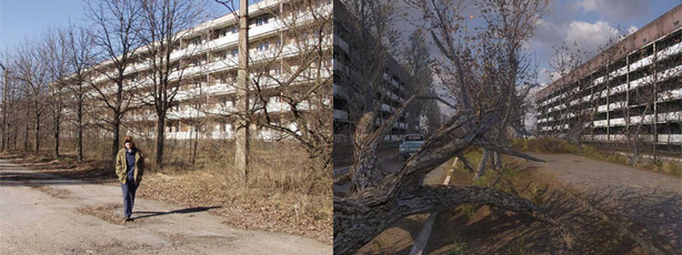
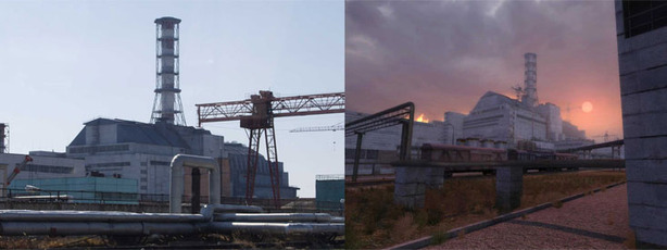
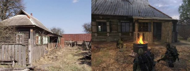
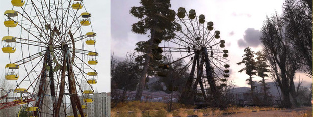
Judge how successful the team has been in recreating the eerie Chernobyl location from the pictures below, on the left you have the inspirational real areas and on the right you have the in-game replicated locations. For the full size images click here, here, here and here. We at bit-tech are cautiously excited about this game. It’s spent so much time in development that the graphics aren’t going to blow us away as we once hoped. However, some of the ideas and plans for gameplay are particularly interesting, so we’ll reserve judgement until our review.
Is S.T.A.L.K.E.R a game you’re really looking forward to in 2007? Let us know in the forums.
S.T.A.L.K.E.R Developer Diary
- We had the idea of a Zone with anomalies, artefacts and stalkers from the very beginning and we were searching for a realistic location to set this in. We wanted to create something as realistic as possible, given that our newly-created X-ray engine allowed near-photo realism.
It didn’t take us long to find a perfect setting, having the Chernobyl exclusion zone virtually next door. Moreover, it was a truly ‘our’ location – so personal and known, our experience of the past. The atmosphere of destruction and abandonment which was pre-existing for the game was more than fitting for the concept. Naturally, to immerse the game world within the Chernobyl zone authentically, we needed to research information on what this area actually contained.
The many trips to the Zone undertaken by us helped us to truly experience atmosphere we wanted to recreate in the game. Looking at the barren streets of Pripyat, the murky sarcophagus of the reactor #4, the red forest, destroyed settlements and the irradiated vehicle cemetery, we envisioned how this all would look at night, when alone and under the hostile gaze of eerie creatures. Add in to that the added the risk of being killed by powerful monsters or a soulless anomaly and we realised that this was exactly the atmosphere we needed.
We wanted the player to live in the Zone and to be able to sense the world around him. We initially thought about creating one big level where there would be no loading points. However, as we were doing everything in maximum detail and quality and the performance capacity of computers today inevitably have a certain limit, such a plan was soon changed to a more feasible one. The world in its entirety got split into 18 huge areas the player was free to traverse as he wills.
To recreate the environment we’ve known since childhood using realistic textures, we processed an incredible number of photos and video material along with architectural layouts of industrial and residential structures. Of course, we didn’t attempt a total match of the in-game areas with the Chernobyl zone locations as we understood that this would make the game very empty in many areas – hardly anyone would enjoy running several kilometers down a monotonously empty field! We instead recreated the familiar, iconic places and images, joining them into levels as required. Some locations are virtually identical to their prototypes: the central lane and the main square in Pripyat and the Chernobyl power plant itself, for example.
Judge how successful the team has been in recreating the eerie Chernobyl location from the pictures below, on the left you have the inspirational real areas and on the right you have the in-game replicated locations. For the full size images click here, here, here and here. We at bit-tech are cautiously excited about this game. It’s spent so much time in development that the graphics aren’t going to blow us away as we once hoped. However, some of the ideas and plans for gameplay are particularly interesting, so we’ll reserve judgement until our review.
Is S.T.A.L.K.E.R a game you’re really looking forward to in 2007? Let us know in the forums.


MSI MPG Velox 100R Chassis Review
October 14 2021 | 15:04


Want to comment? Please log in.