Side Panel
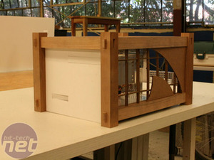
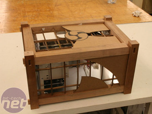
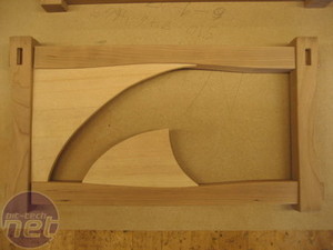
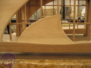
The side panel was probably the hardest "design" element of the case. Since the SG01 is essentially a small form factor case, there wasn't a lot of space. Those who are familiar with my designs know I also am not a big fan of clutter - so I had to put something striking in a small space, but not make it look busy.Fortunately, I had a theme to work from. I based the design off of the symbol that the client gave me for inspiration. The panel's end design is simply a slightly abstracted version using only one of the three points. Not only would it be an attractive option for him, but it would also create that subtle effect that I was looking for.
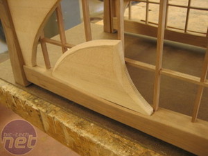
The design could then be carried onto the top of the case, though certainly not just simply repeating it. Instead, the design seems to "center" on the top and wrap around the sides.
First, I needed to do some design work using one of the best tools - cardboard.
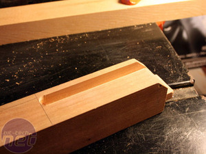
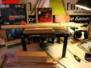
The process of building this part was simple. I routed out where the spruce pieces were supposed to go after I planned them to the proper thickness.
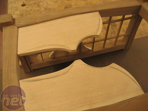
After that, I cut the pieces roughly so they’d fit in their respective grooves. Then I drew the curves and cut them out.
To give more three dimensionality to the case and take advantage of the layered design, I did some light sculpting of the spruce using a pneumatic drum sander for the rough sculpting and my random orbital sander for the finish sanding.

MSI MPG Velox 100R Chassis Review
October 14 2021 | 15:04




Want to comment? Please log in.