I’m really glad that EA is continuing to develop the Mirror’s Edge series, even on the iPhone. A lot of people poo-pooed the original for being too short and for annoying combat, but it wasn’t something I had a problem with. The fighting wasn’t great, but it served the purpose of slowing the game down a bit. The game may have been short, but it was also very replayable.
I’m pretty happy then that EA’s iPhone version of the game, which I got a chance to see yesterday, is treading along the same grounds. Combat is only a minor part of the game; little more than a distraction really, and the game is short but replayable. That last fact is doubly important for a mobile game.
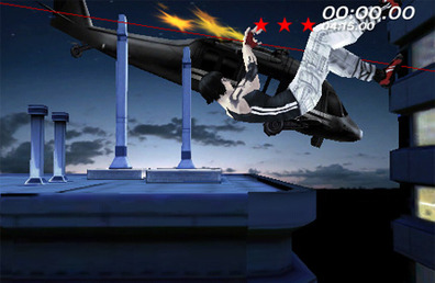
In other areas though, an awful lot of the game has changed. The limits of the iPhone processing power has meant a change to a side-on perspective, though Mirror’s Edge on the iPhone still manages to retain 3D visuals. Here the simple, stylised look of the series work to EA’s advantage – there’s no need for detailed textures and the like.
[break]

The change in viewpoint brings with it some alterations to the control system too, but the focus on timing and precision is still paramount. Quick side swipes across the screen command Faith to run, building up speed as she goes. A quick downward swipe gets her to skid or roll under obstacles, while an upwards movement forces a jump. Both of these are context sensitive, just as in the original game too. Swipe up while running up to a wall and you’ll launch into a wallrun, but do it in front of a box to just leap over it.
This all sounds a bit too simplistic admittedly – I thought the same when the controls were explained to me, but it’s not as easy as it sounds. The timing needs to be perfect and as you build momentum then barriers will come thicker and faster. As levels increase in complexity then multiple paths emerge and you find new environments to scale. There may only be two main actions for you to do, but getting them right and realising which is relevant is where the challenge is. Quite clever, really.

EA Mobile has built on the core singleplayer game, with its story that runs parallel to the original game (of which we didn’t get to see much of), with some extras too. There are hidden items to collect which unlock wallpapers, badges and so on. There’s a speedrun mode too, but while EA has been quick to dub it as a ‘multiplayer’ mode, the reality is that it isn’t. It’s not head to head, at least. You just charge through levels against the clock, with an option to upload your final time to Twitter or Facebook when you’re done. So, yes, you can challenge your friends, but a league table with some social networking bolted on isn’t really ‘multiplayer’ in our books.
That’s not really a valid reason to dismiss Mirror’s Edge on the iPhone though, as the game still looks pretty darn good for something that will run on a mobile phone. The way that elements from the original game are interwoven into the mobile spin-off, such as loading screens based on the scrolling newsalerts seen in the elevators of the PC and console version, is very clever and hints at a decent level of attention to detail. It’s definitely a title we’ll be keeping a close eye on in the future.
I’m pretty happy then that EA’s iPhone version of the game, which I got a chance to see yesterday, is treading along the same grounds. Combat is only a minor part of the game; little more than a distraction really, and the game is short but replayable. That last fact is doubly important for a mobile game.
In other areas though, an awful lot of the game has changed. The limits of the iPhone processing power has meant a change to a side-on perspective, though Mirror’s Edge on the iPhone still manages to retain 3D visuals. Here the simple, stylised look of the series work to EA’s advantage – there’s no need for detailed textures and the like.
[break]

The change in viewpoint brings with it some alterations to the control system too, but the focus on timing and precision is still paramount. Quick side swipes across the screen command Faith to run, building up speed as she goes. A quick downward swipe gets her to skid or roll under obstacles, while an upwards movement forces a jump. Both of these are context sensitive, just as in the original game too. Swipe up while running up to a wall and you’ll launch into a wallrun, but do it in front of a box to just leap over it.
This all sounds a bit too simplistic admittedly – I thought the same when the controls were explained to me, but it’s not as easy as it sounds. The timing needs to be perfect and as you build momentum then barriers will come thicker and faster. As levels increase in complexity then multiple paths emerge and you find new environments to scale. There may only be two main actions for you to do, but getting them right and realising which is relevant is where the challenge is. Quite clever, really.

EA Mobile has built on the core singleplayer game, with its story that runs parallel to the original game (of which we didn’t get to see much of), with some extras too. There are hidden items to collect which unlock wallpapers, badges and so on. There’s a speedrun mode too, but while EA has been quick to dub it as a ‘multiplayer’ mode, the reality is that it isn’t. It’s not head to head, at least. You just charge through levels against the clock, with an option to upload your final time to Twitter or Facebook when you’re done. So, yes, you can challenge your friends, but a league table with some social networking bolted on isn’t really ‘multiplayer’ in our books.
That’s not really a valid reason to dismiss Mirror’s Edge on the iPhone though, as the game still looks pretty darn good for something that will run on a mobile phone. The way that elements from the original game are interwoven into the mobile spin-off, such as loading screens based on the scrolling newsalerts seen in the elevators of the PC and console version, is very clever and hints at a decent level of attention to detail. It’s definitely a title we’ll be keeping a close eye on in the future.

MSI MPG Velox 100R Chassis Review
October 14 2021 | 15:04


Want to comment? Please log in.